
bp DARC is bp’s annual Australian and New Zealand retail conference, bringing its dealer network together for several days of business, connection and shared learning.
For DARC 2026 in London, I developed the event identity and visual system for London Calling, creating a flexible design language that could extend across the full event experience.
Client: bp | Seamless Events
Event identity / Creative direction / Presentation design / Digital / Event collateral
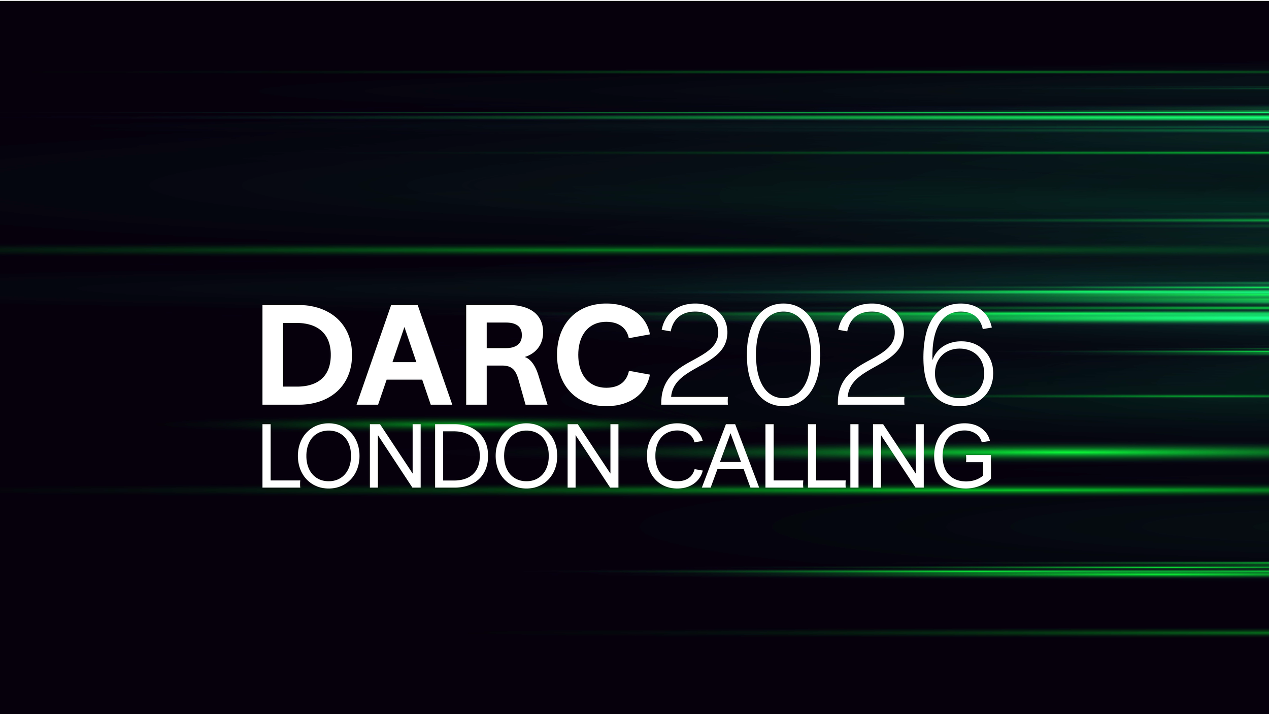
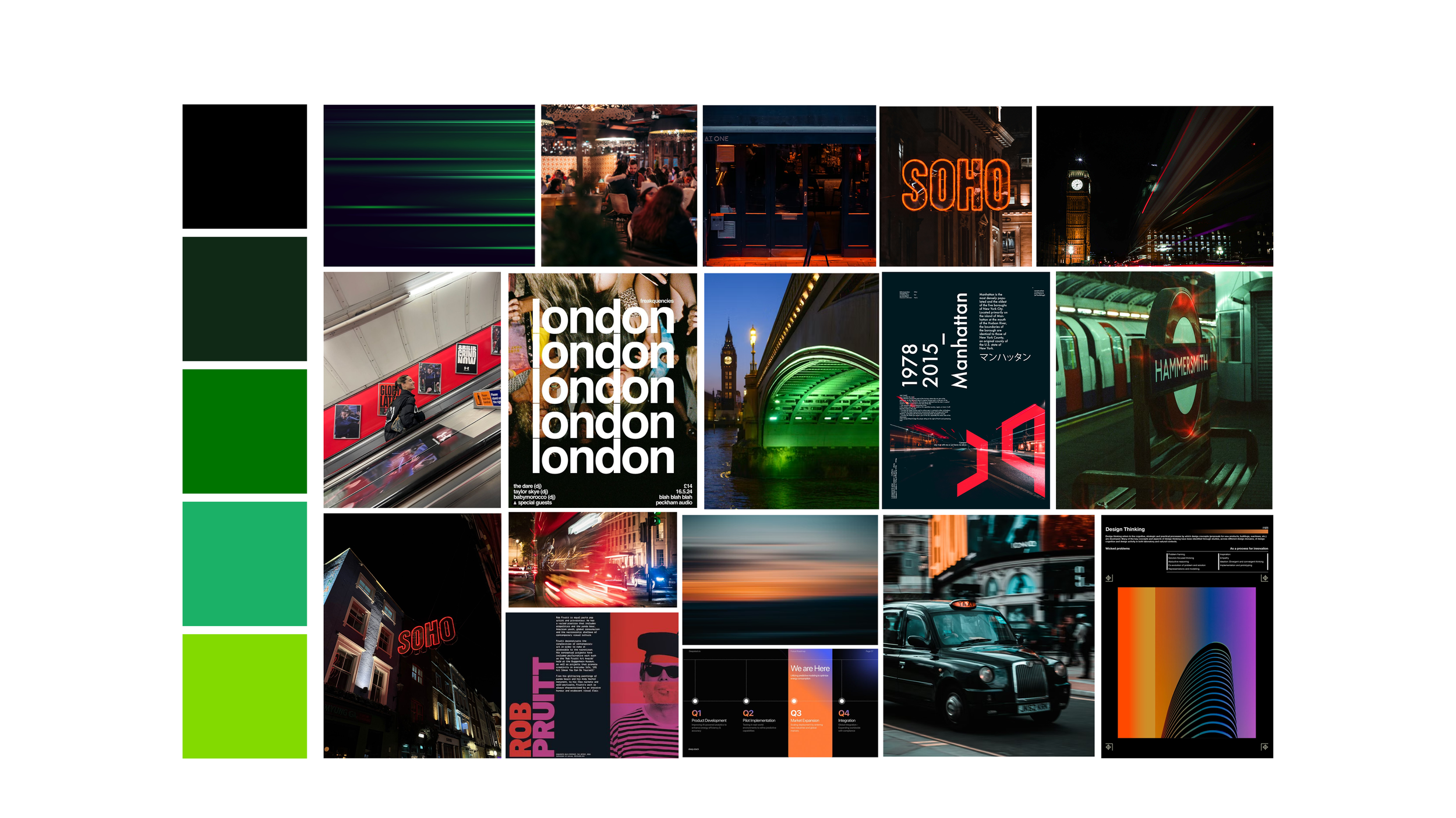
The direction was designed to feel confident, contemporary and distinctly London, using typography, movement, imagery and the bp colour palette to bring energy to the event while remaining simple and controlled.
London Calling became the central visual device, supported by the DARC2026 event identifier and the line Global insight, local knowledge. The system was designed to flex across different formats, allowing the campaign line to scale, crop and shift while the core event identity remained consistent.
Rather than relying on familiar London landmarks or visual clichés, the identity took its cues from the pace and character of the city. Motion streaks introduced energy and movement.
Contemporary London photography brought warmth and context to the system, capturing the architecture, streets, nightlife and everyday atmosphere of the city.
The identity was then carried across presentations, registration and email communications, digital assets and onsite event touchpoints, creating a consistent visual experience from pre-event communications through to the event itself.